Juno & The Peacock
St. Petersburg, FL
A New American restaurant layered with myth, texture, and contemporary glamour in downtown St. Petersburg.
THE ASK
Establish a name and visual identity for a destination restaurant that feels indulgent yet approachable for design-savvy locals and high-rise residents.
SERVICES
RAND STRATEGY
- Naming
BRAND DESIGN
- Visual Identity
- Collateral Design
- Signage & Wayfinding
- Wine Label
- Production Management
CREDITS
AvroKO, Interior Design
Karen Culp @kculp_com,
Sunny Collabs @sunnycollabs, @visitspc, Interior Photography
The Approach
Aligned with the client’s portfolio of bird-inspired hospitality brands, we named this concept after Aesop’s fable The Peacock & Juno, a story that reminds us every creature possesses its own unique gifts. Juno, the Roman goddess at the heart of the tale, lends the brand its stately presence and visual spectacle.

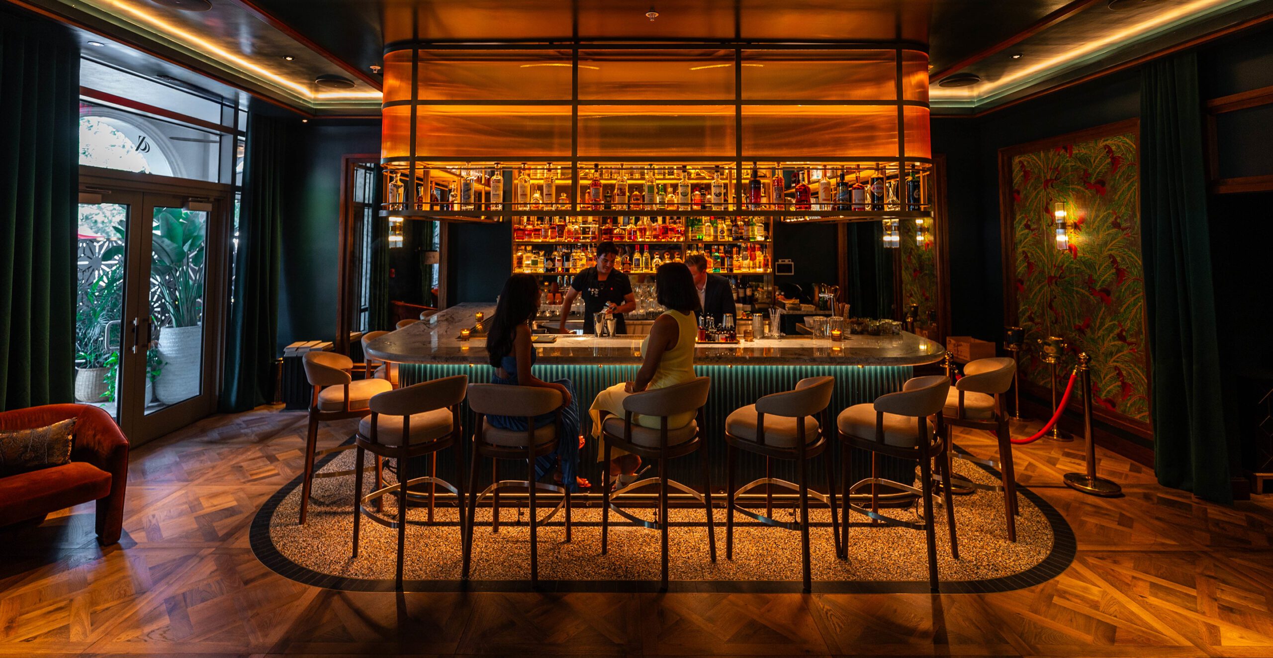
The Brand System
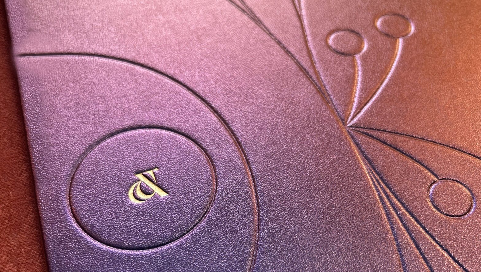
A refined serif logotype, accented with hand-drawn ligatures and a sculptural peacock motif that echoes the form of an ampersand. Jewel tones mirror the interiors and mythic namesake. The system extends to the adjacent Pluma Lounge through a shared icon, thematically uniting both spaces while preserving their individuality.

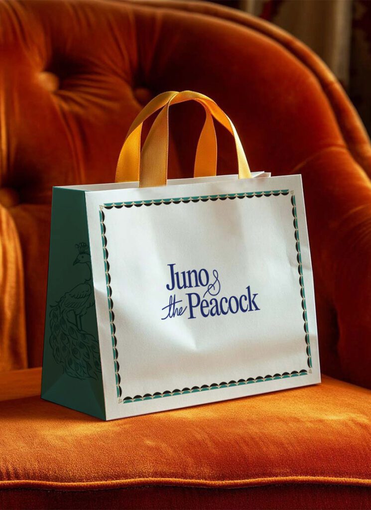
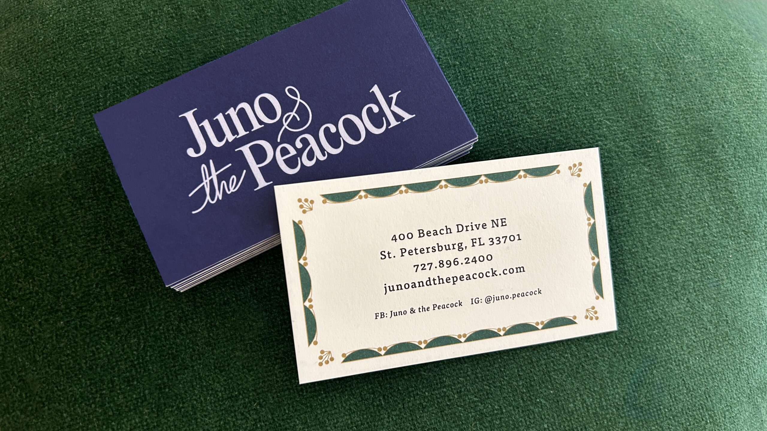
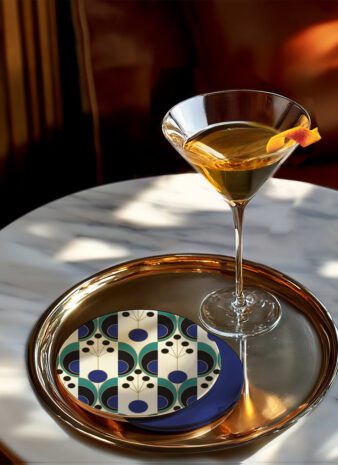
The Expression
Printed collateral carries the identity forward through layered compositions, gold detailing, and deep color fields that echo the brand’s visual richness. Typography blends classical structure with modern restraint, while sculptural patterning appears across touch points. Embossed menu covers and refined materials create a sense of quiet spectacle and tactile elegance.