Harvest Inn
St. Helena, CA
A refreshingly distinct vineyard-side resort that brings a twist to Napa Valley charm.
THE ASK
To refresh and reposition a beloved St. Helena resort to reflect their unique style of hospitality. Capture what makes the property so unique in order to help clarify its place in a crowded market of increasingly upscale competitors.
SERVICES
BRAND STRATEGY
- Positioning
- Brand Strategy
- Messaging Guidelines
- Brand Guidelines
BRAND DESIGN
- Visual Identity Refresh
- Collateral Redesign
- Website Redesign
- Photography Creative Direction
CREDITS
Katie Newburn, Photography
The Approach
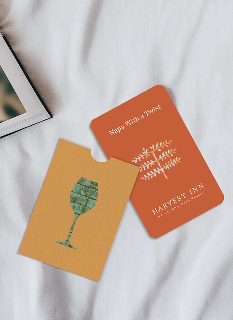
Harvest Inn is firmly rooted in Napa’s tradition of fine hospitality, but its “tipsy” brickwork and flair for unexpected programming set it apart. We leaned into the interplay between heritage and eccentricity to create a brand that reflects its cultural terroir and delivers a sense of place that feels both timely and unmistakably local.

The System
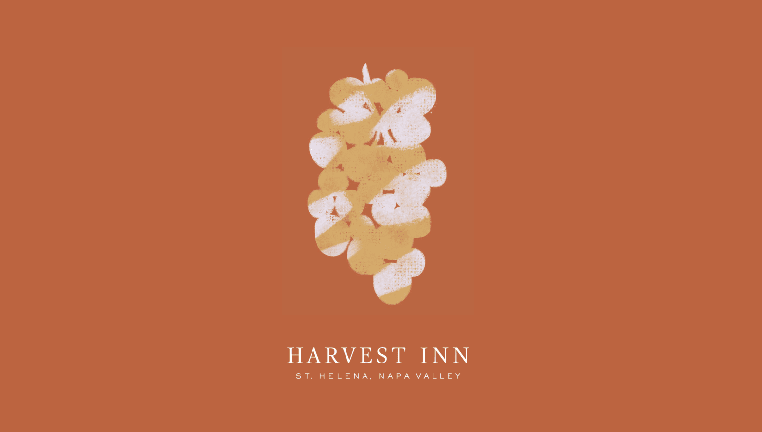
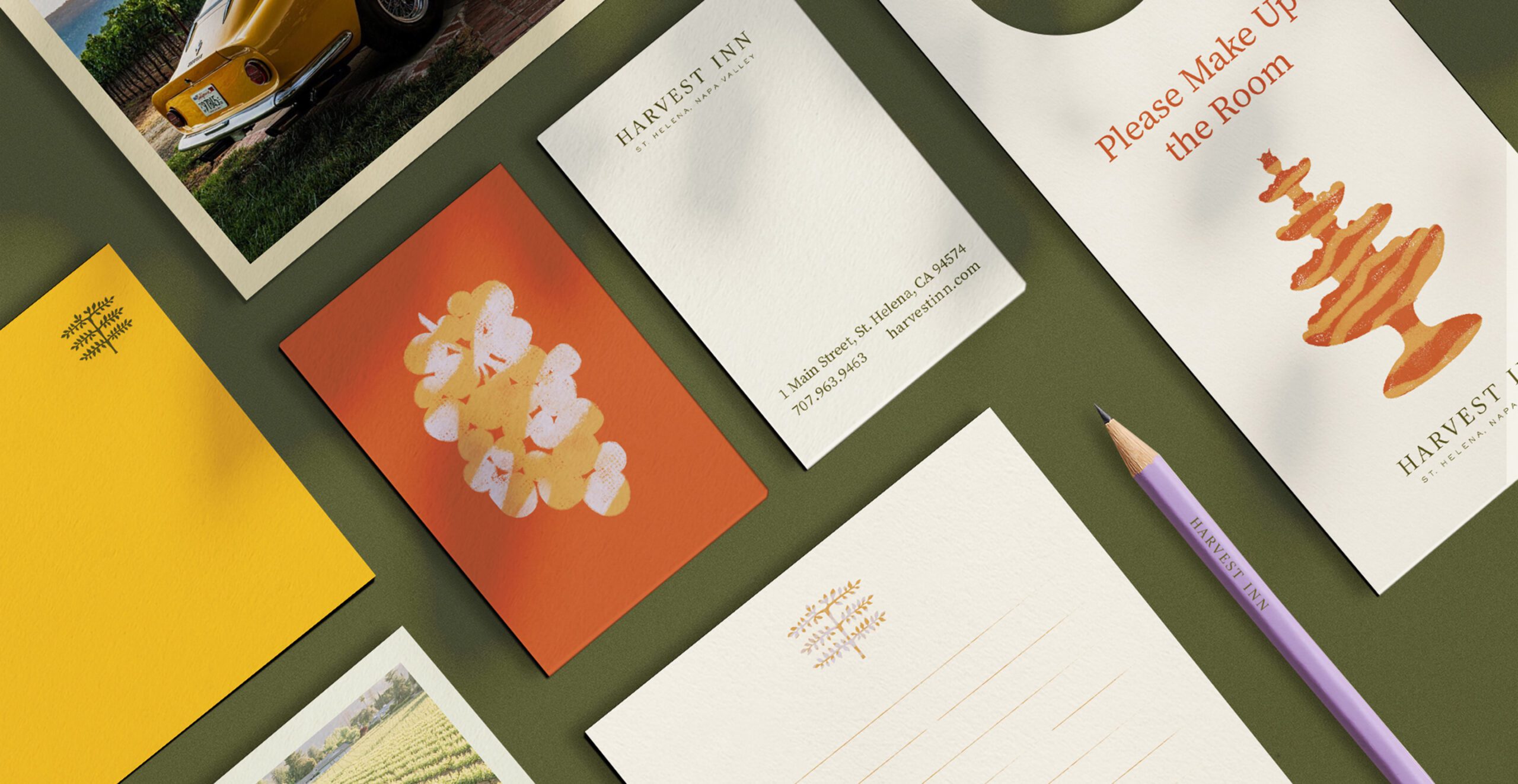
Our illustrative style incorporates textures from around the property—specifically the brick paths, vineyard soil, and redwood bark that define the landscape. These tactile elements add a rich sensory layer to a system of silhouetted icons, each one representing a distinct aspect of the guest experience.


The Expression
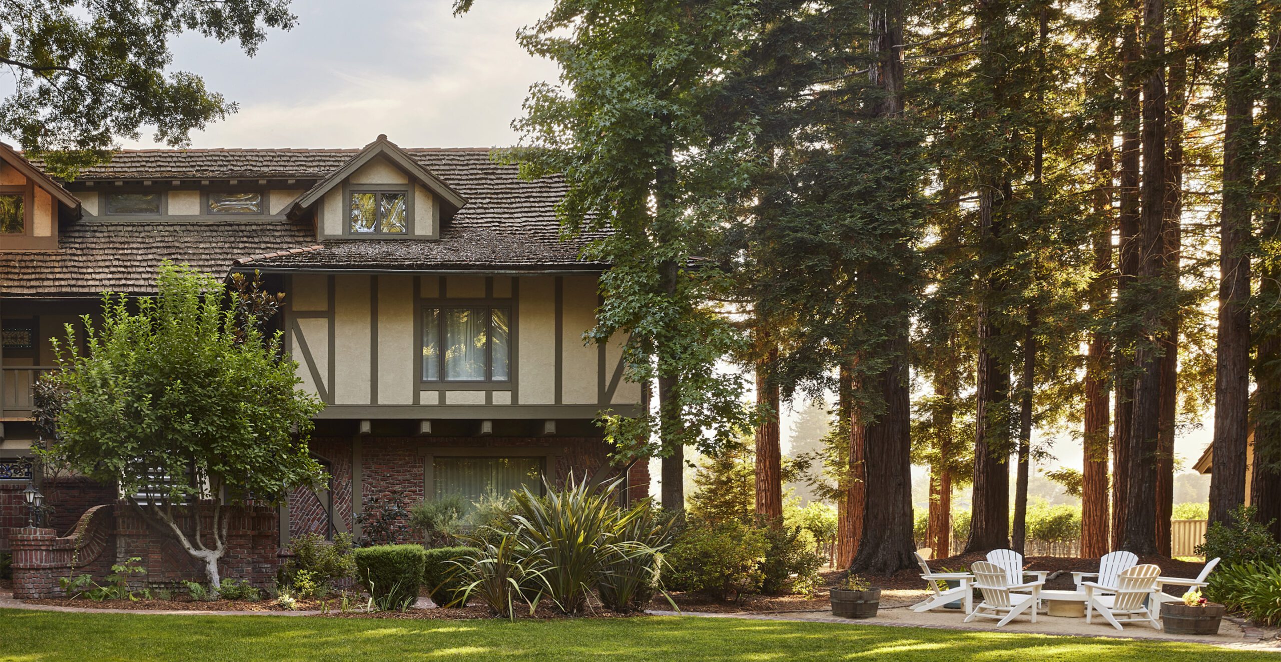
Writing resists the urge to oversell, instead trusting in the power of real moments. The result is an expression of the resort’s laid-back elegance that’s confident, warm, and grounded. Photography mirrors this approach, with understated styling, sunkissed ambient light, and texture-rich scenes.